Loading case study…

Loading case study…

Hitachi Energy (formerly ABB Hitachi Power Grids) is one of the world's largest manufacturers of high-voltage equipment for electricity transmission and distribution. The asset management division needed a unified platform to help grid operators plan, track, and optimise asset lifecycles — from investment through maintenance, upgrades, and replacement.
The existing workflow relied on disconnected systems, manual processes, and outdated planning tools. I led UX design for the Asset Investment Planning (AIP) platform: a configurable Work and Assets Dashboard and the core planning module used by 200+ operators managing portfolios worth $50M+ in critical infrastructure.
Grid operators were managing portfolios worth $50M+ using fragmented tools and manual processes. This created three critical problems:
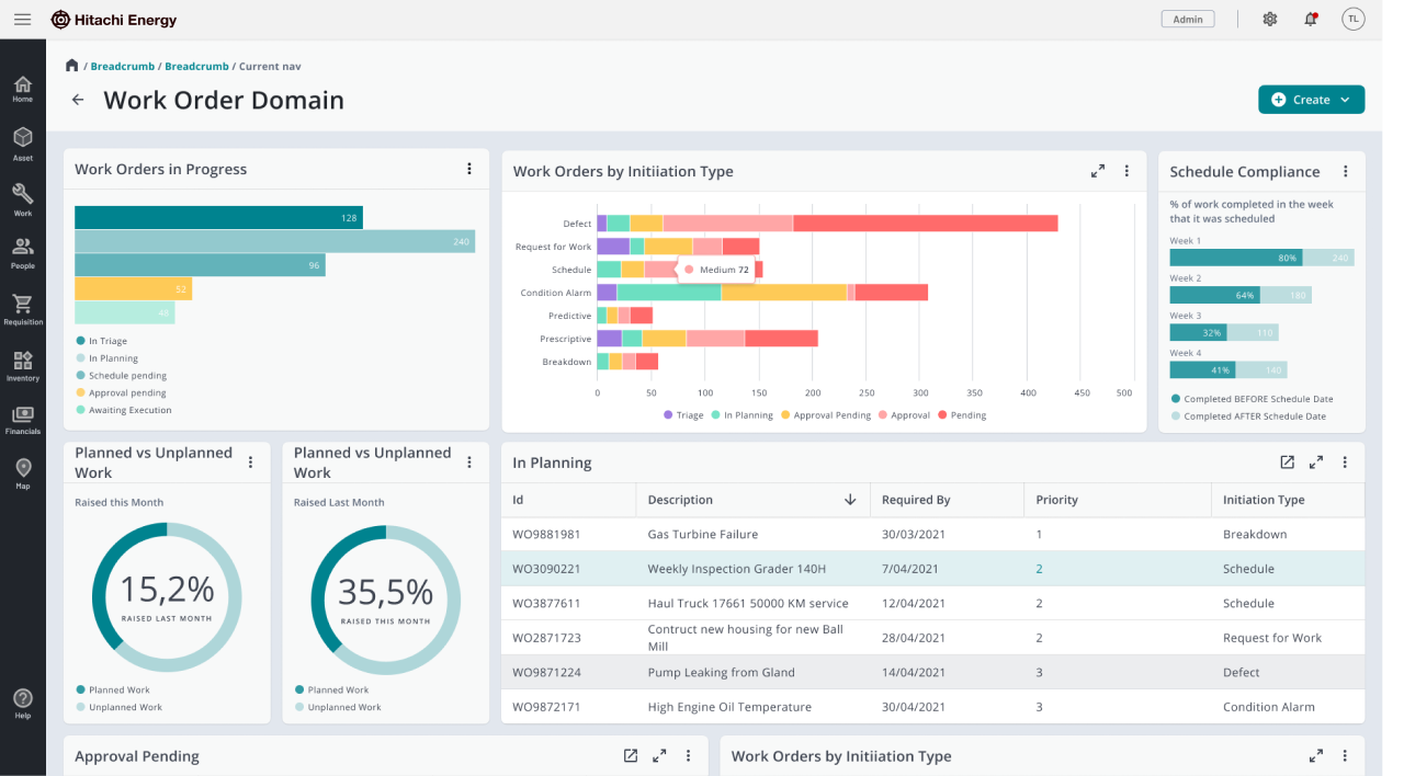
Existing dashboard — data visible but not integrated into the planning workflow
When I shadowed grid engineers, I observed them copy-pasting data between Excel, SAP, and internal databases, manually tracking lifecycles across disparate systems, and creating reports that required constant manual updates. One senior engineer said: "By the time I finish compiling the data and creating the plan, half of it has already changed. We're always working with stale information."
Unify data access and embed it directly into the planning workflow, so engineers don't have to leave the tool to gather information.
Match the interface to how engineers think: timeline and dependency chains, not lists and feature-grouped navigation.
I spent the first 6 weeks understanding grid operations: shadowing 8+ engineers through complete planning workflows, contextual inquiry at multiple facilities, and interviews with stakeholders across operations, finance, and technical teams.
Engineers think in fiscal quarters and multi-year horizons. They needed to visualise asset lifecycles over time; static lists didn't match their mental model.
85% of planning time was spent gathering and consolidating data from multiple systems. The core problem was fragmentation, not methodology.
Grid operators need to see the logic behind any system. 'Black box' automation would be rejected; any solution had to show underlying data and rationale.
Start with a portfolio-level view (budget allocation, asset health) before drilling into individual assets. Engineers need the big picture to prioritise where to focus.
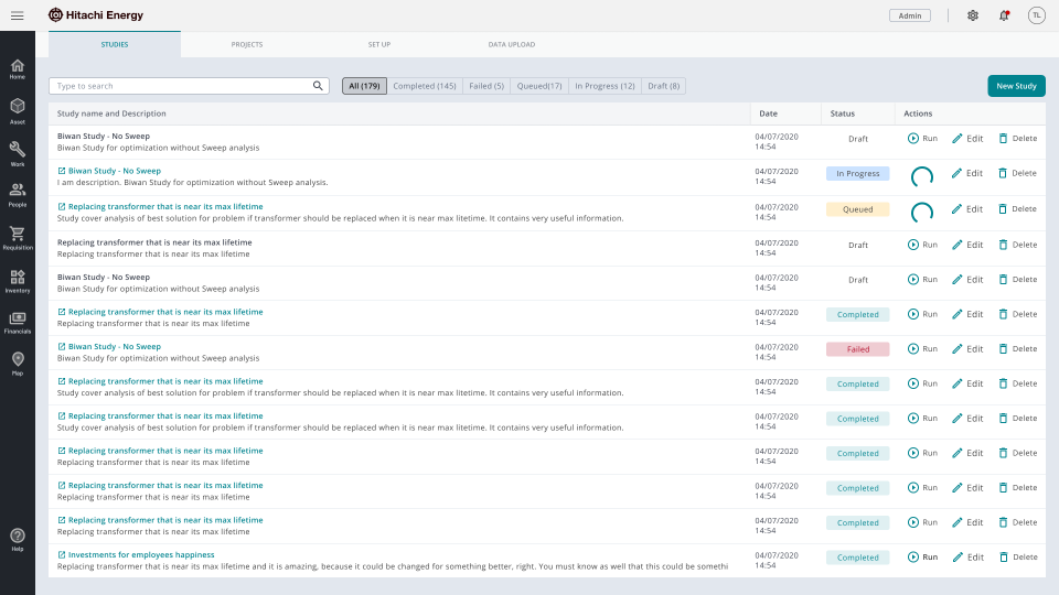
Studies catalog — status badges and search so analysts see state without opening records
The Studies tab is a categorised search catalog so users can find studies by keywords or status. Actions like edit, delete, and run are available to manage studies. Status badges (completed, in progress, failed, queued) let analysts see state at a glance without opening each record.
Through research we confirmed grid operators think in time-based dependencies and budget cycles. We chose a Gantt-style timeline over Kanban or list views: multi-year horizon, colour-coded tasks, dependency chains as connecting lines, budget impact visible on the timeline.
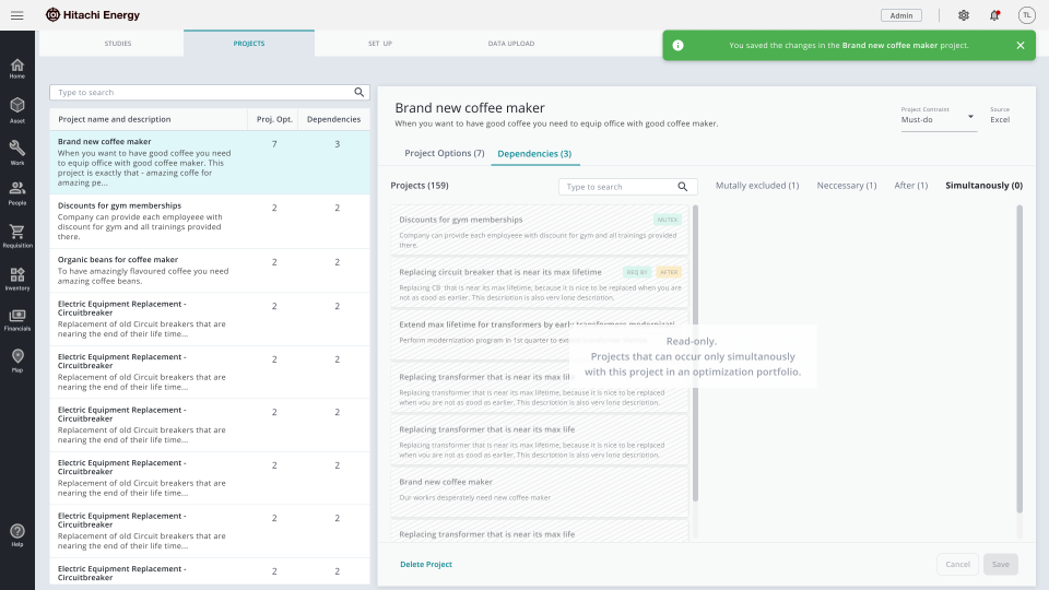
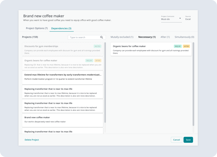
Project library — catalog and dependency state side by side, no round-trip to configuration
The Project tab uses a split-screen layout: on the left, the project catalog (organised by categories or folders, with search and filters); on the right, project details with options and dependencies. Users can add or remove optimisation projects and save changes without leaving the screen.
Testing showed engineers wanted to move tasks visually to find optimal schedules.
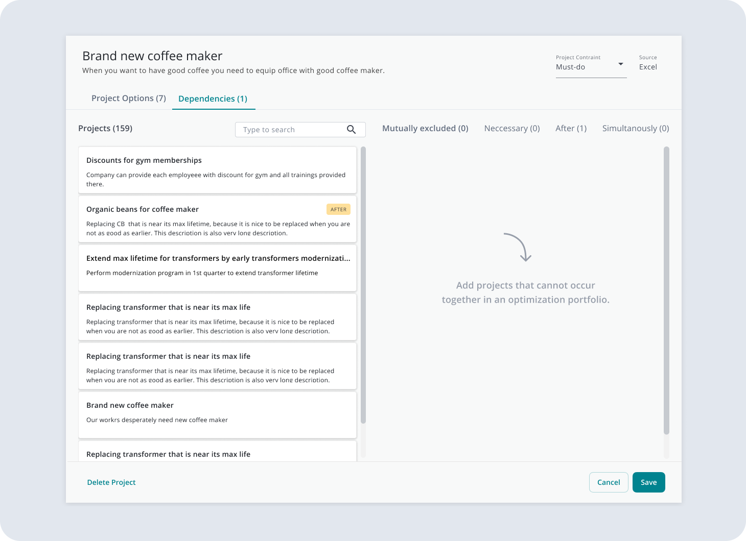
Sequence builder — relationship types as direct manipulation
Status badges for main and sub-project sequences
We prioritised direct manipulation over form-based creation, with real-time conflict detection and budget recalculation as tasks were moved.
Grid assets have complex dependency chains (e.g. you can't maintain Asset A until Asset B is upgraded). We showed dependencies as visual connections with constraint checking, so engineers see ripple effects before committing changes.
Budget constraints drive planning decisions. We integrated real-time budget tracking and KPI dashboards into the planning flow so financial impact is visible as plans are adjusted.
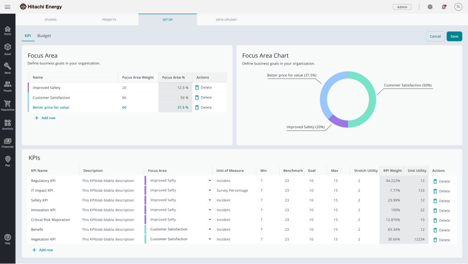
KPI and budget setup — Focus Area charts and live portfolio impact as settings change
The "Set Up" tab is an interactive dashboard with KPI widgets and smart data tables. Focus Areas charts and KPIs let users add or remove business tasks and track project portfolio performance. A dedicated Budget sub-tab supports adding and removing business tasks into the budget, with live portfolio impact as settings change.
We ran a 3-month pilot with 12 operators, then rolled out to 200+ users. Success metrics were defined up front with product and stakeholders; we measured against them post-launch.
"For the first time in 15 years, I can see our entire portfolio in one place and actually understand what's happening. This fundamentally changes how we work." — Senior Grid Engineer
"What used to take me two weeks now takes two days. I can finally focus on strategic planning instead of data gathering." — Asset Planning Manager