Loading case study…

Loading case study…
Localsearch helps Australian small businesses get found and connect with local customers. Their product set includes a next-generation website system powering dozens of client sites, an SMB-facing dashboard, a consumer website, and a mobile app.
I worked as Senior UX & Product Designer with a team of designers from April 2019 to October 2020, across two parallel and connected initiatives. The first was a next-generation website template system — designing dozens of client sites at scale, grounded in UX research, SEO findings, and mobile-first best practices. The second was the SMB-facing dashboard — the single place where business owners managed their Google Ads, website, reviews, and Google My Business listing. The two initiatives reinforced each other: the dashboard's website section surfaced the health and value of the template system directly to clients. The mobile app (consumer-facing local search) was also in scope; it is not covered in detail here.
Localsearch's value proposition to SMBs was: we manage your local digital presence so you don't have to. That promise rested on two things: the websites clients paid for had to be genuinely good — fast, mobile-first, found in search, designed to convert — and the dashboard had to make it easy to see that and act on it.
In practice, both were under-delivering. Client sites varied widely in quality, structure, and SEO. The dashboard, meanwhile, was organised around Localsearch's internal product structure, not around how an SMB thought about their business. The result: clients didn't understand what they were getting, and the product team had no scalable way to raise quality across dozens of sites without a template system grounded in research.
Building websites for SMBs at scale is a design and systems problem. Without a clear template strategy grounded in UX and SEO analysis, each site was a one-off — inconsistent information architecture, varying content hierarchy, no shared component logic, and no way to apply learnings from one site to others. We needed a template system that was opinionated enough to guarantee quality and flexible enough to serve diverse business types.
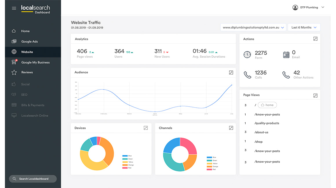
The SMB dashboard was structured around Localsearch's product categories: an Ads section, a Website section, a Reviews section, a GMB section. That taxonomy made sense internally but was foreign to clients. Business owners didn't think in product silos — they thought: "Are people finding me? Are my reviews okay? Are my ads working?" A dashboard that mirrored internal product structure was answering the wrong question. And surfacing too much depth per section created paralysis rather than clarity.
Build a website template system grounded in UX research and SEO analysis so quality scales across dozens of client sites without relying on one-off decisions.
Redesign the dashboard around SMB outcomes — get found, run ads, earn trust — not around Localsearch's internal product categories.
Connect the template system and the dashboard so clients can see the value of their website as a managed, live product, not just a delivered asset.
We ran two complementary research streams. For the website template system, we analysed existing client sites against SEO best practices — content hierarchy, heading structure, local keywords, page speed, mobile layout — and identified the patterns that correlated with better findability and conversion. We worked with the CX team to understand what clients asked about most, where competitor sites were stronger, and what "a great local business website" meant to both the business owner and their customers. Findings were synthesised into a set of design principles and a component strategy that underpinned the template system.
For the dashboard, we embedded with the CX team to map where clients disengaged, what they called support about, and how they described their digital presence. We observed how SMBs actually used Google Ads, GMB, and review tools independently — where they gave up, what they trusted, and what "managing my presence" meant day-to-day.
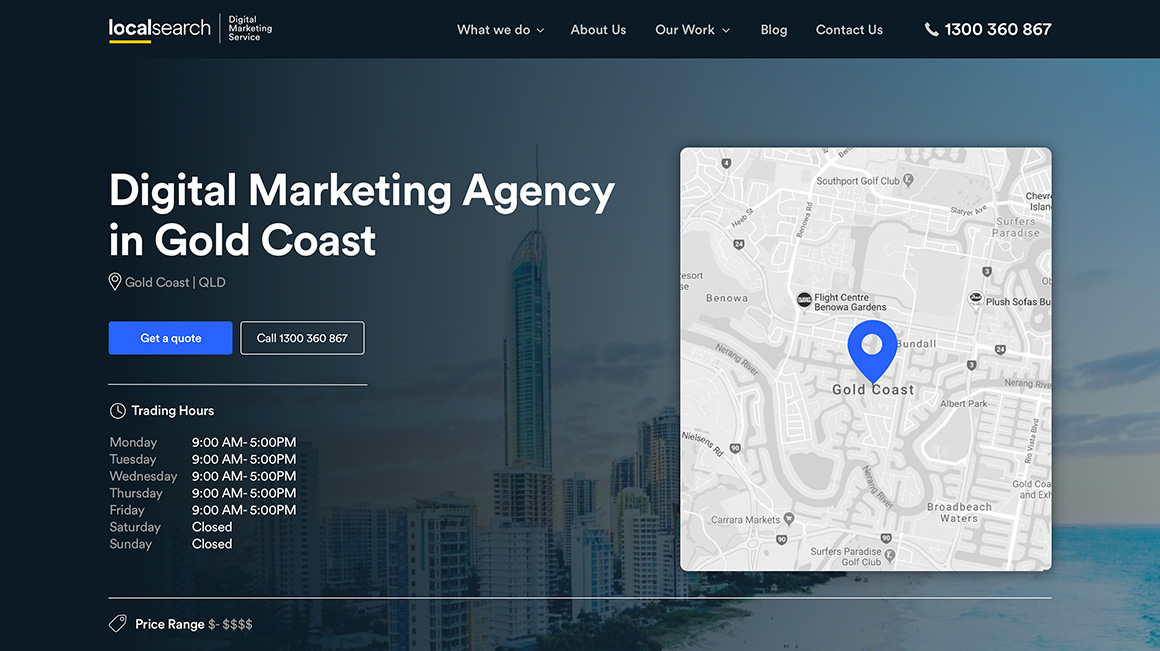
Effective local business sites lead with who you are, where you are, and what you do — in that order. Generic templates that prioritised brand over location and service consistently underperformed in local search.
Designing templates for mobile first forced the right prioritisation of content, removed clutter, and produced pages that loaded faster and converted better. It was a constraint that improved every decision downstream.
Business owners didn't think in 'campaigns' or 'GMB listings.' They thought: am I getting found, am I getting called, are my reviews okay? The dashboard needed to answer those questions directly — not route them through product taxonomy.
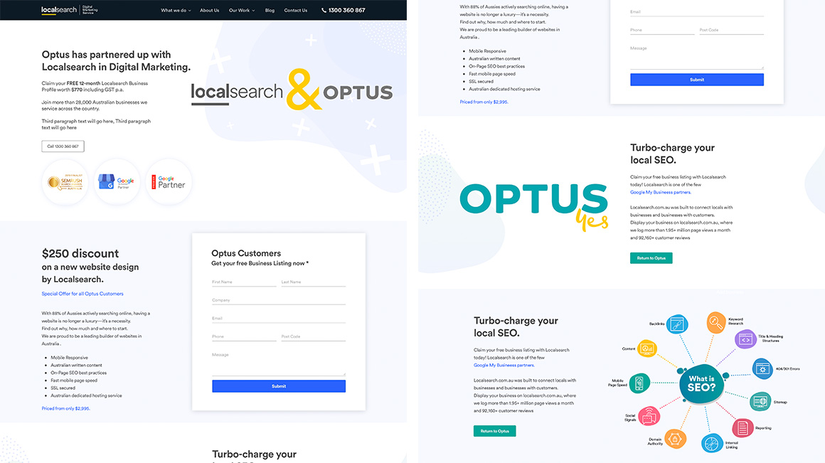
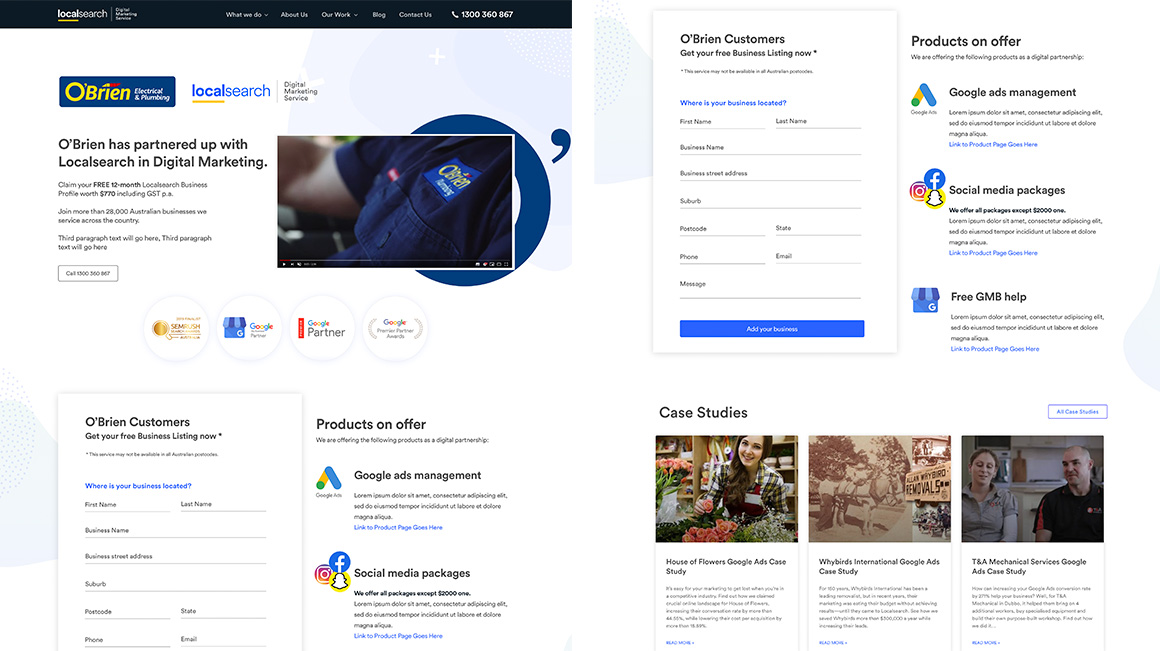
Strategic choice: Rather than designing templates top-down (pick a layout, fill in the content), we built the template system from the inside out — starting with the components and content blocks that research showed mattered most for local search and conversion: business name, location, primary service, trust signals (reviews, credentials), and a clear call to action. These became the non-negotiable core of every template; everything else was flexible.
We analysed dozens of existing client sites against SEO criteria and user behaviour patterns, then defined a shared component library that any designer on the team could use to build a new client site quickly, consistently, and with confidence. The result was a system that scaled: each new site we built applied the same principles, which meant learnings from one site improved all future sites.
Design decision: Every template was designed mobile-first, with content hierarchy and page structure informed directly by SEO analysis and CX findings. This wasn't a post-hoc optimisation — we defined the mobile layout and heading structure as the primary design surface and adapted to desktop from there. Page speed, image treatment, heading hierarchy, and local keyword placement were all part of the design spec, not a separate technical audit after the fact.
Content hierarchy and structure — local intent first, mobile layout primary
Rationale: In partnership with the CX team, we could see that page structure and content decisions — things designers controlled — had a direct effect on local search rankings. Making SEO a design input rather than a design review filter meant we shipped sites that were already aligned with best practices, rather than retrofitting them after launch.
Strategic choice: We restructured the dashboard around business owner outcomes rather than product categories. Each section was named and framed around what the SMB cared about, not what Localsearch sold internally. This removed the product taxonomy as a source of confusion and made the dashboard feel like it was answering the client's question, not routing them through ours.
Dashboard — four pillars framed around SMB outcomes, not Localsearch product names
Why this mattered beyond UX: It also de-risked upsell. When a client wasn't paying for Ads, the section could surface a clear value message without making an empty product area feel like a broken dashboard. The structure made commercial growth feel natural rather than intrusive.
Design decision: For each of the four areas — Google Ads, website, reviews, Google My Business — we surfaced a single status indicator and one primary action. We removed secondary metrics from the dashboard view entirely.
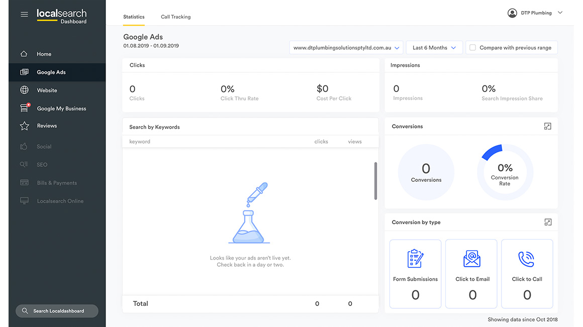
Dashboard — single status indicator and primary action per area (Ads, Website, Reviews, GMB)
Rationale: Research showed the dashboard visit was a health check, not a management session. Showing more metrics per area increased dwell time but decreased action rate — clients were reading rather than doing. One status and one action kept the dashboard as a launchpad and made it feel useful in a five-minute check-in from a phone. Deep management lived in dedicated flows reached from each section.
Design decision: We treated reviews and Google My Business as distinct but related: reviews build trust with potential customers; GMB determines whether the business appears in local search. Making both visible with clear status and a Respond to reviews CTA turned the dashboard from a reporting surface into an active brand management tool — something clients felt was working for them, not just telling them things.
Reviews and GMB — current status, rating, listing health, and the next action
A research-led, mobile-first, SEO-aligned template system shipped across dozens of client sites. Consistent components and design principles meant each new site applied the same quality baseline — learnings from one site improved all future builds.
SMBs could manage Google Ads, their website, reviews, and Google My Business in a single, outcome-first dashboard. The structure reduced support calls and increased daily active use.
By making SEO a design input rather than a post-launch audit, both the template system and dashboard actively supported client findability — delivering on Localsearch's core promise of managing local digital presence.
"Before, I had no idea if my ads were working or what my reviews looked like. Now I can check everything in one place in a couple of minutes." — SMB client, Localsearch
"The website section made it easy to show clients that their site was live, up to date, and working for them — it changed the conversation from 'what am I paying for?' to 'what else can we do?'" — Account manager, Localsearch
We did not capture baseline metrics before either initiative. For the template system, we would track Core Web Vitals, local search impressions, and conversion rates per template type — before and after rollout — so we could attribute performance to specific design decisions. For the dashboard, we would measure daily logins, action rate per pillar (e.g. Respond to reviews clicked, GMB updated), and support ticket volume for navigation or comprehension issues. Both would give us evidence to iterate rather than intuition.
Platform: Web dashboard, client-site template system, portal.
Domain: Local search, SMB digital presence management.
Let's discuss product strategy challenges. st.slavka@gmail.com