Loading case study…

Loading case study…
Chameleon is RxPx's purpose-built medical SaaS that enables secure, scalable, and configurable workflows for prescribing, onboarding, and managing medicines. The platform had evolved over many years with inconsistent components and a dated user interface.
I led UX and product design for this initiative. Our work focused on building a design system and applying it across the whole solution. The strategic decision was to adopt a modified version of the Material Design system so we could refresh the UI quickly while establishing clear rules for a unified look and feel.
The strategic challenge: modernize the platform to remain competitive while supporting 200+ active healthcare providers without disrupting critical prescribing workflows. Rebuilding from scratch would take 18+ months and risk patient care continuity. The design system approach allowed us to ship improvements iteratively — refreshing 50+ screens while maintaining feature parity and system stability.
RxPx was facing competitive pressure from newer medical SaaS platforms with modern interfaces. Healthcare providers cited the dated UI and complex configuration process as friction points during contract renewals. The product needed to modernize quickly to retain existing clients and remain competitive for new business.
The constraint: the platform was actively used by 200+ healthcare providers managing patient prescriptions. Any disruption to workflows could impact patient care. We needed to improve the product without a risky full rebuild.
The front end partly used Material Design but was inconsistent and did not follow brand guidelines. Some parts of the application looked different from the rest, causing confusion and a lack of cohesion for users.
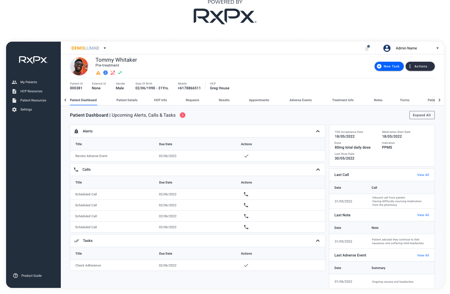
The patient domain contained many tabs and multiple forms. Forms were poorly structured and hard to navigate; each page had 10–12 action buttons. Fields were ungrouped and in no particular order, so finding the right information was time-consuming. Pathology results had no progress tracking or comparison; notes history was a long log with no search or way to relate notes — and making updates meant leaving the page for another part of the application.
Internal nurses and admins add and configure new patient programs for healthcare providers. The process was very complex and unintuitive, with a long list of settings and code tables (e.g. SQL sink settings). Users were often lost and unsure of the next steps; the only way to get answers was to reach out to product owners. There was no in-product guidance for finding the right settings.
Establish a single design system and apply it consistently so the product feels cohesive and maintainable.
Simplify the patient domain: better IA, grouped forms, and fewer surface-level actions so users can find and complete tasks without getting lost.
Make configuration discoverable and guided — reorganise settings and add product onboarding so internal users can self-serve instead of relying on product owners.
Before redesigning anything, we needed to understand where and why the product was failing people. I conducted user research with internal nurses through Zoom interviews over several weeks: what their day-to-day tasks looked like, how they experienced the configuration process, and what they would change. Findings were synthesised and prioritised with product and engineering so the design system, patient domain, and configuration work could be sequenced and scoped.
When different parts of the same product look and behave differently, users can't build reliable mental models. The design system wasn't just a visual problem — it was slowing everyone down.
The patient domain was structured around database fields, not around how nurses and clinicians think. Ungrouped fields and 10–12 actions per page made every task feel harder than it should.
Internal users were lost not because they lacked skill — they lacked context. They needed discoverable, step-by-step guidance built into the product, not a separate document or a call with a product owner.
Strategic choice: We considered a full rebuild; we chose a design-system-led refresh because it delivered modernisation without disrupting 200+ active users or risking patient care. We created a new colour theme and updated the framework to use the right atoms and components consistently. That gave us a single source of truth for the UI and made it possible to refresh dated screens without reinventing patterns each time.
Design system — unified colour theme and components applied consistently
Research showed that nurses and clinicians think in tasks and sections (e.g. "patient details", "pathology", "notes"), not in a flat list of database fields. We chose expandable panels over more tabs so users could see the full structure at a glance. We improved the information architecture: fields were grouped into sections within expandable panels with descriptive names.
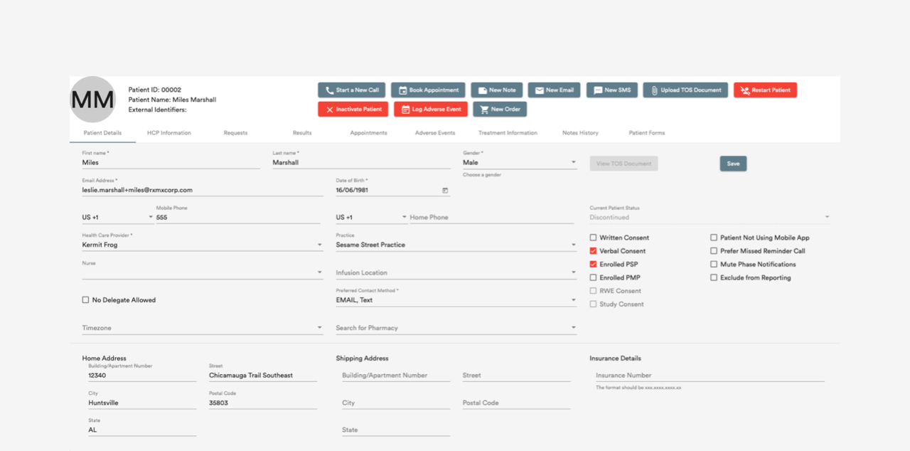
Old patient details page — Before: many tabs, forms, and 10–12 actions per page
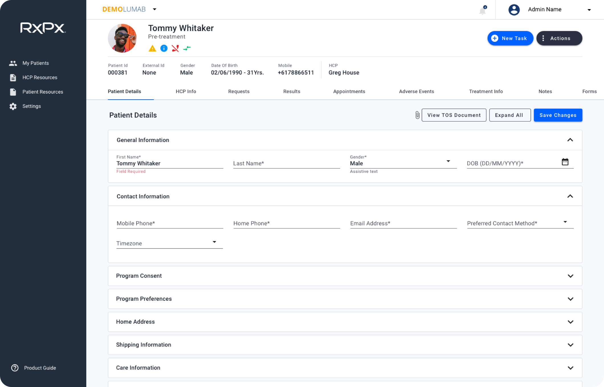
New patient details screen — After: grouped sections, clearer hierarchy, fewer surface-level actions
For the patient header, we combined many action buttons into two main dropdowns — New Task and Actions — and added active patient call profile indication.
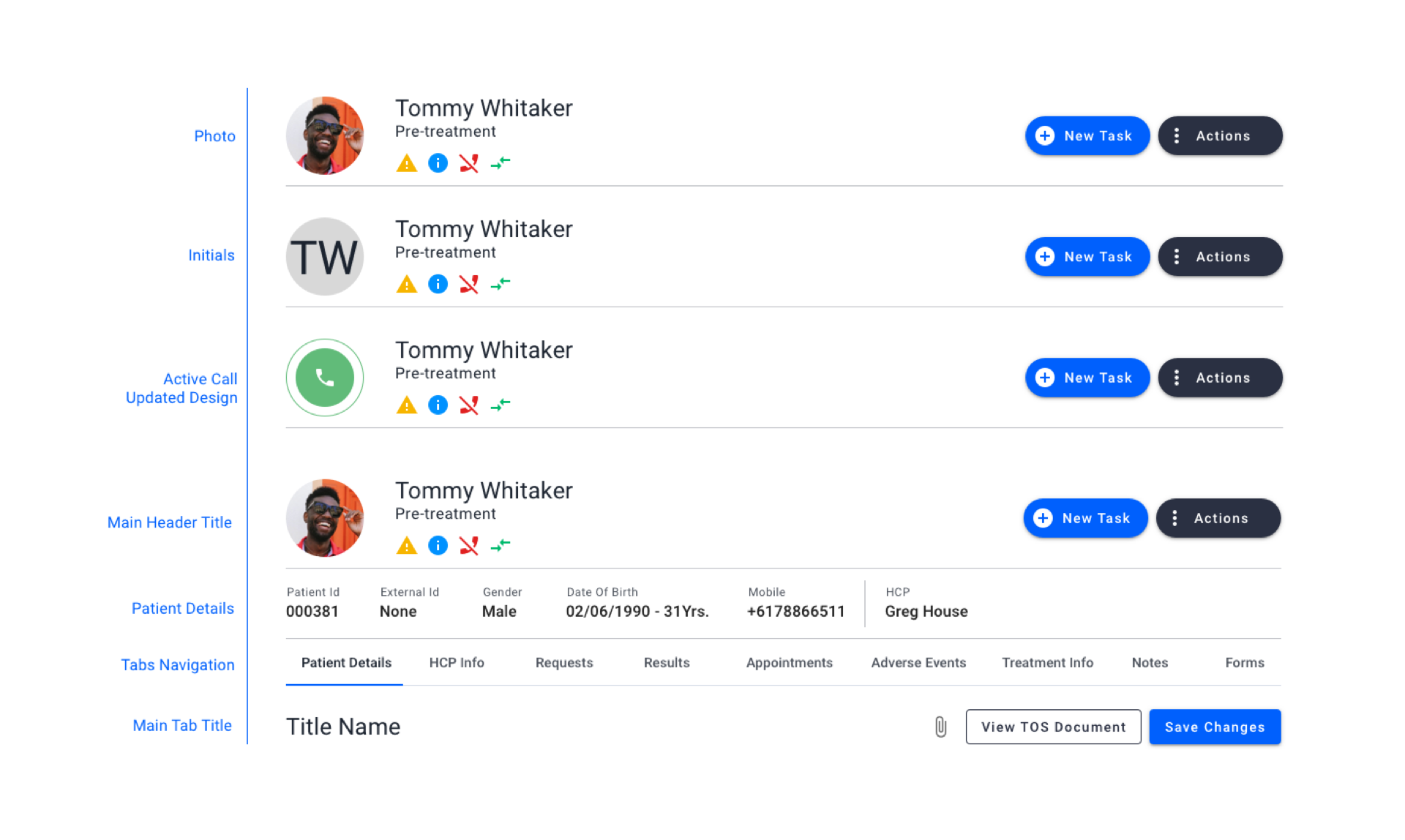
Patient header states
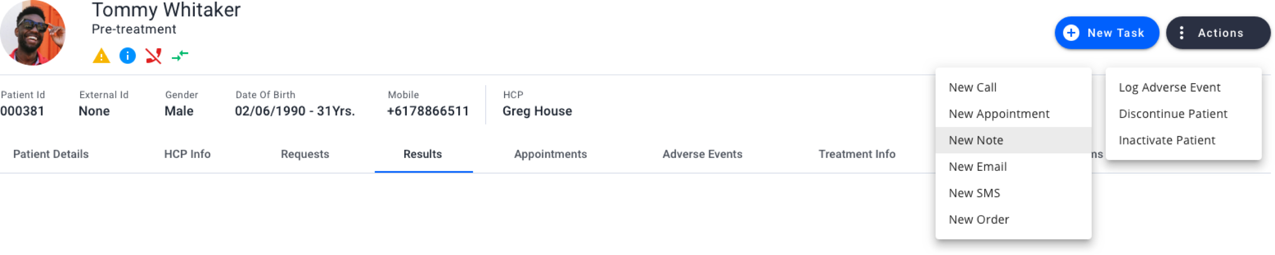
New Patient Header Section
The same structural patterns extended into day-to-day clinical workflows: how patient details are organised, how pathology is reviewed over time, and how notes are searched and edited without leaving context.
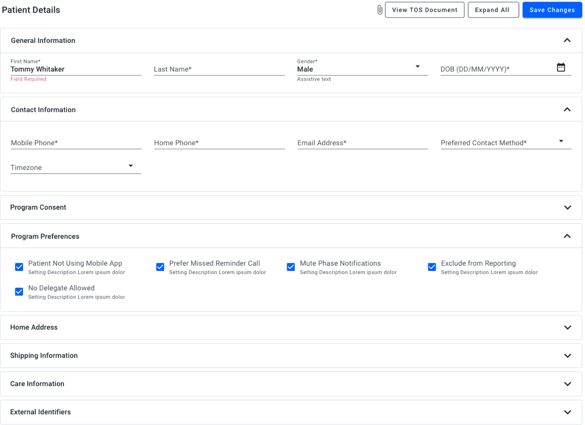
Patient details form with expandable sections
Why table and graph: Clinicians need to compare results over time and spot trends. We chose dual view (table + graph) with an interactive timeline and progress tracking; PDF export supported sharing and records.
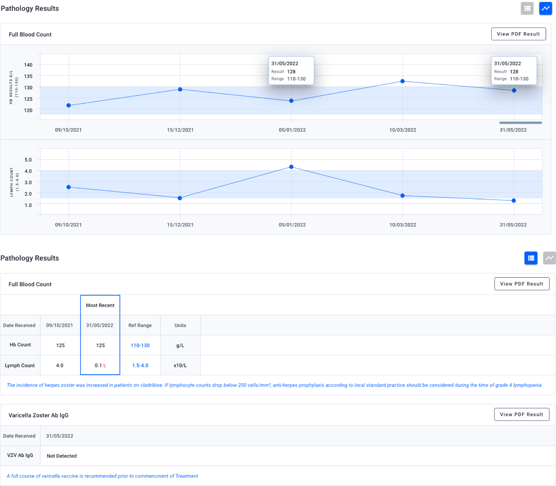
Pathology results — table and graph views with timeline and export
Why in-page editing for notes: We introduced expandable rows (parent/child), in-page editing via modals and popups, and filters plus search so users could find and update notes without navigating away.
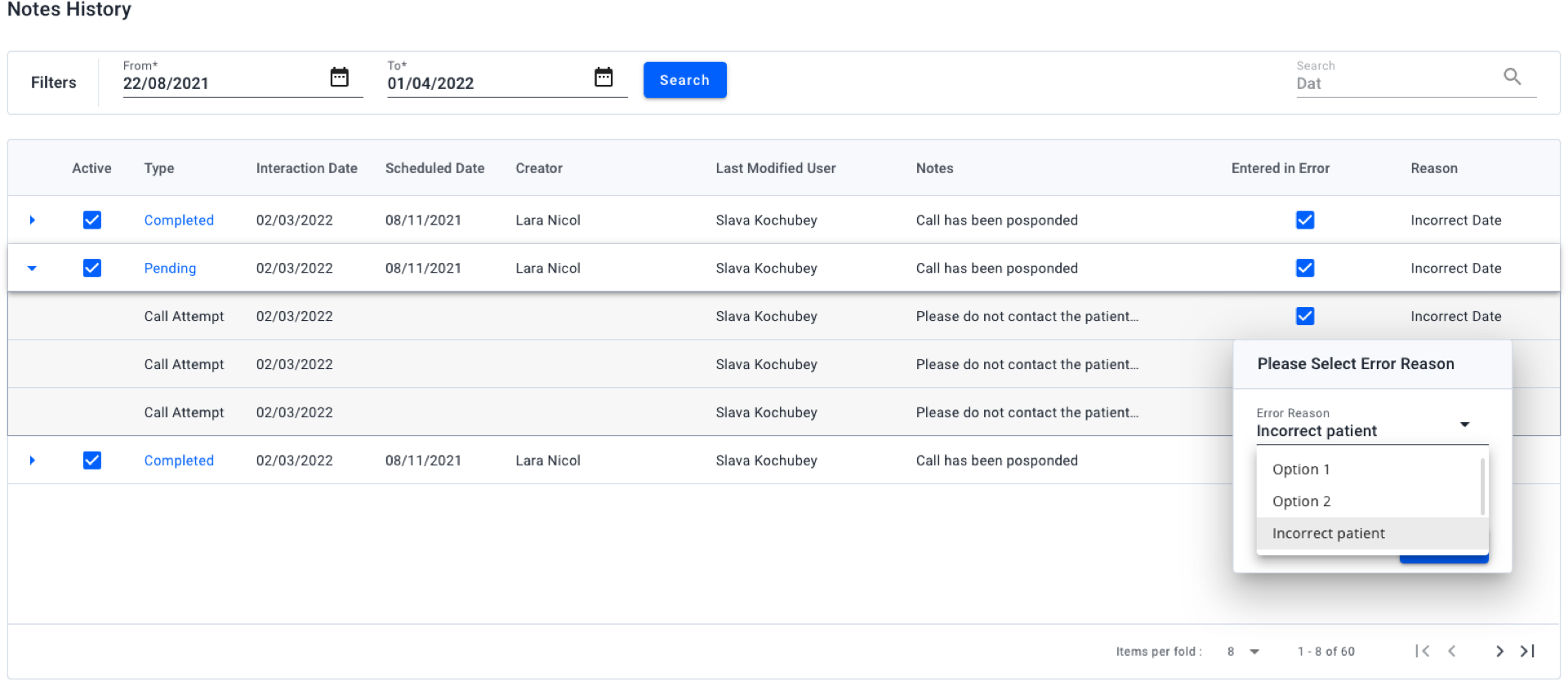
Notes history — search, filters, and in-page editing
Research with internal nurses showed they think in tasks rather than in system buckets or a flat settings list.
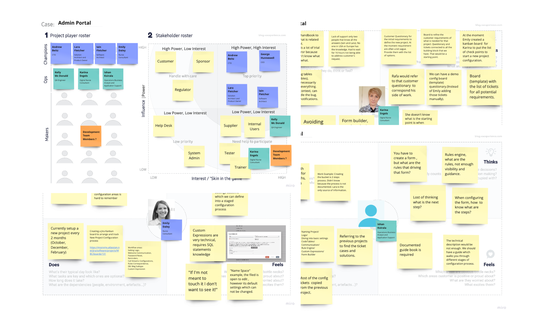
User research and interviews — research with internal nurses to understand configuration pain points
We chose subject-based categories and separate tabs with clear names. We applied an 80/20 approach — the top 20% of settings that 80% of users need most often were prioritised — and the first section in each category was expanded by default.
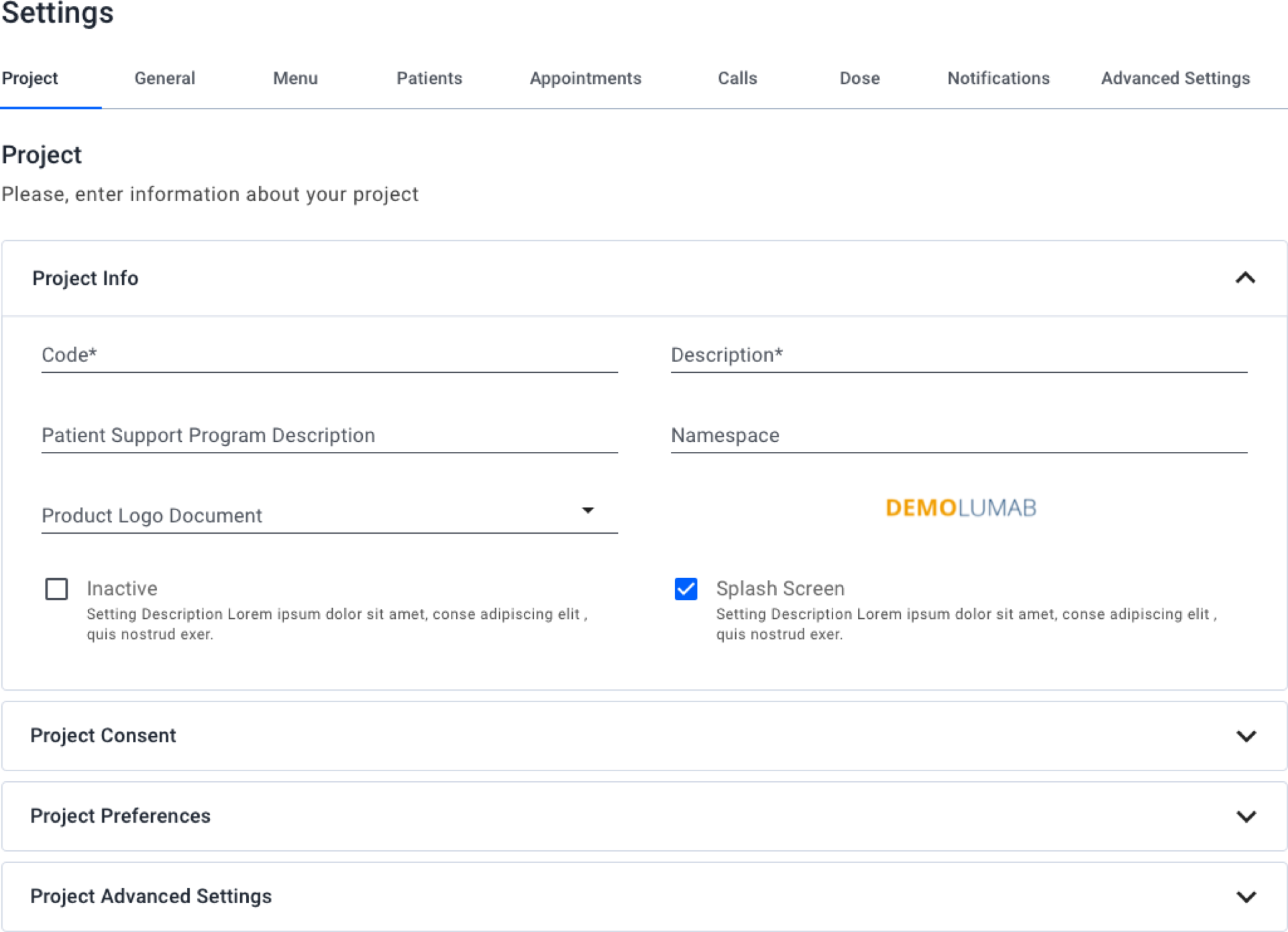
Reorganised settings by category — subject-based categories and clear navigation
We introduced the Product Guide — a collection of user guidelines and product tours aligned to the main configuration use cases. We also added coach marks: temporary messages that educate users through new or unfamiliar flows. They can be chained so the primary action of one coach mark leads to the next. The "Skip tour" button gives users an escape path; progress display is consistent across the tour.
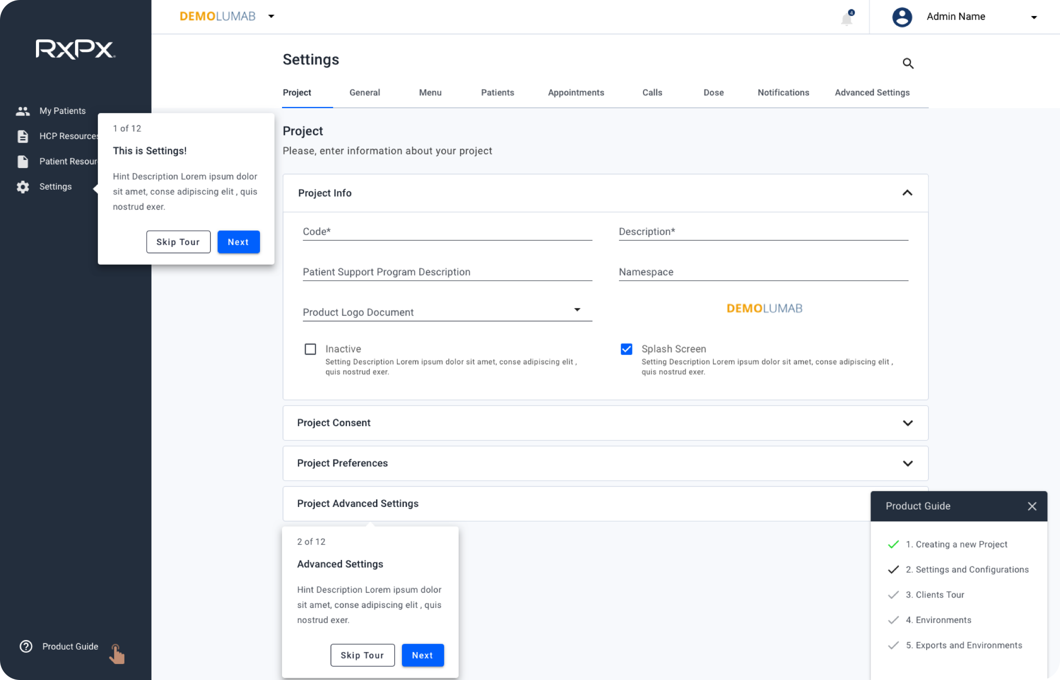
Product Guide and coach marks — discoverable onboarding for configuration
Below, the Product Guide in context (CTA, menu, and tour states) and coach marks as step cards — how chained tours and escape paths appear in the UI.
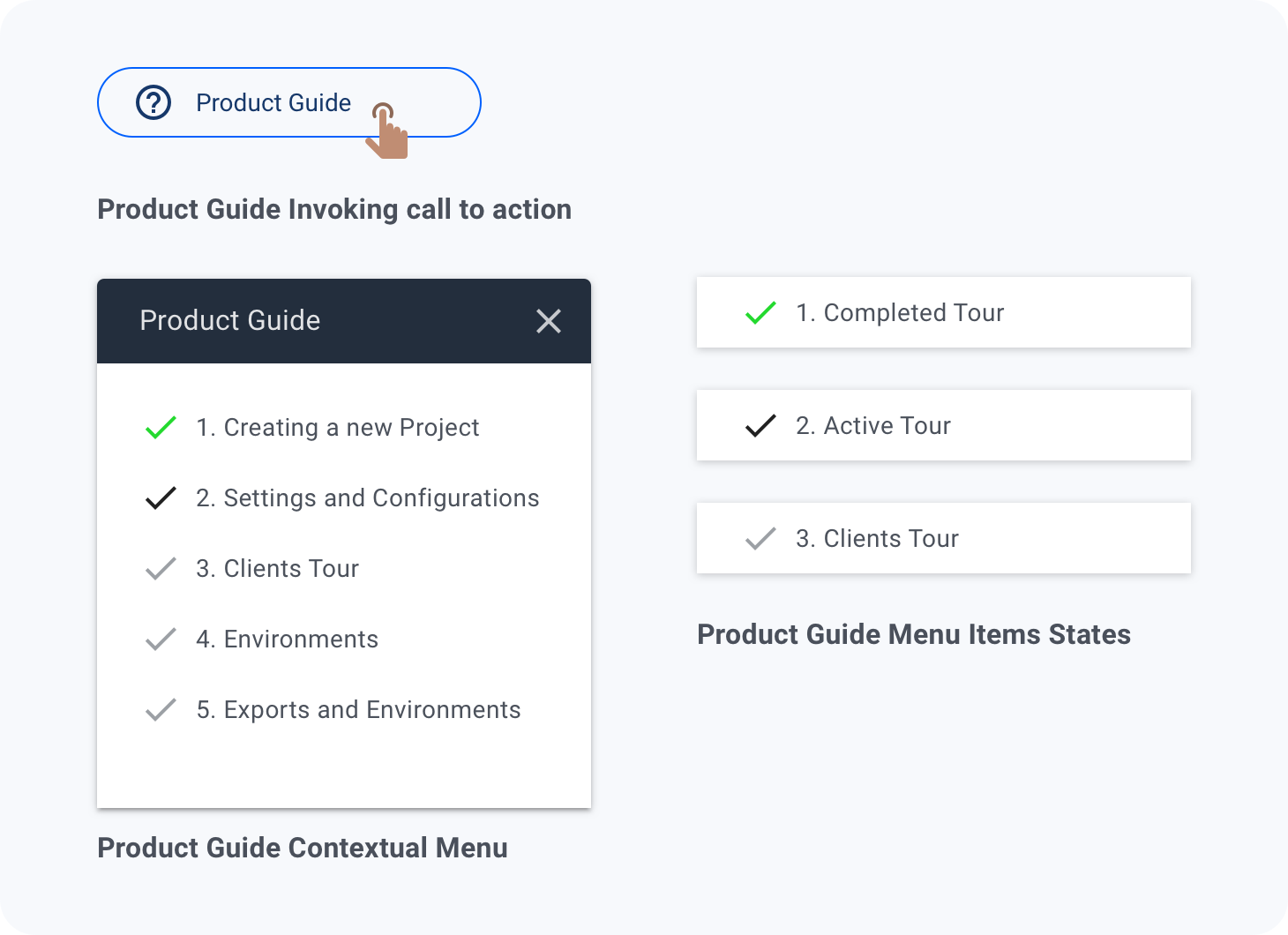
Product Guide — CTA, contextual menu, and tour states
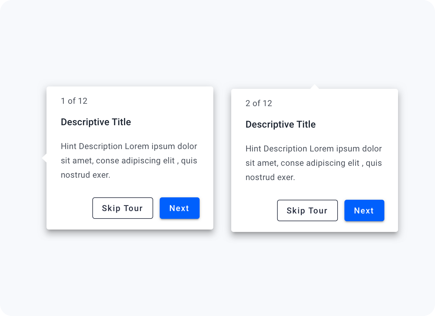
Coach marks — step cards with Skip tour and Next actions
Platform modernisation at scale: Modified Material Design applied consistently across 50+ screens and 30+ reusable components. This systematic approach allowed us to modernize the platform without disrupting active users, maintaining feature parity while establishing design consistency.
Self-service enablement: Subject-based settings reorganisation with 80/20 prioritisation, Product Guide, and coach marks enabled internal users to configure new programs independently, reducing bottlenecks and dependency on product owner support.
Competitive positioning: The design system foundation positioned RxPx to iterate faster on future features while maintaining visual and interaction consistency. Healthcare providers reported improved confidence in the platform's modernity during renewal discussions.
"The new patient domain is so much cleaner. I can actually see what I need without clicking through ten tabs." — Nurse, RxPx
"Setting up a new program used to take forever because I didn't know where anything was. Now the guide just walks me through it." — Internal configurator, RxPx
We didn't capture baseline metrics before the redesign. To make design impact explicit, we would track time to complete a new program configuration, support tickets related to settings, and Product Guide usage or completion, then compare after launch so outcomes are evidence-based.