Loading case study…

Loading case study…
Softplus has been building software for the transport and service industries since 1991 — desktop, web, and mobile solutions for booking, dispatch, rating, job allocation, EDI, and customer portals. Their product suite includes JobPlus (general cartage, vehicle and container transport, rural), FreightPlus (freight manifesting), StorPlus (contract storage), and FlexiJob (service and contracting), plus bespoke interfaces and integrations.
I led product design and later the design team over five years. My work focused on unifying the product experience and modernising the brand so that both off-the-shelf and bespoke solutions felt like one system. I was responsible for redesigning the Softplus brand, illustrating design ideas with wireframes and process flows, developing UI mockups and prototypes, and front-end design and development for websites and apps — from discovery through to shipped product.
Softplus had a strong technical reputation and a long history in transport and contracting, but the market expected modern, cohesive software. The product suite had grown organically: JobPlus, FreightPlus, StorPlus, and FlexiJob each had different UI patterns and a disjointed feel. The brand and interfaces felt dated compared to newer entrants. The business needed to present a clear story — from booking to billing, all your work in one system — without losing the depth that made each product valuable.
There was no shared design language across desktop, web, and mobile. Dispatchers and contractors moving between JobPlus, FreightPlus, and FlexiJob encountered different navigation, forms, and terminology. Cross-selling and positioning the suite as one offering was harder when each product looked and behaved like a different vendor. Consistency was not only a UX issue but a commercial one.
Design was largely project-by-project. Wireframes and prototypes existed, but there was no repeatable system or component set. Front-end implementation varied by product and platform. To support both product evolution and bespoke work (EDI, interfaces, customer portals), we needed a way to scale design without reinventing patterns every time.
Establish one brand and one design language across the suite so sales and customers see a single, professional system.
Introduce a design system and shared components so new features and products ship faster and feel consistent.
Align research and design with how operators work — jobs, routes, status, proof of delivery — so dispatch and mobile workflows feel native to the domain.
I spent time with dispatchers, warehouse staff, contractors, and customers to understand how they used the products day to day: how jobs were created and allocated, how rating and manifesting flowed, and where they lost time or made errors. I also worked closely with sales and support to see how the fragmented experience affected positioning and support load. Findings were synthesised with product and engineering so we could prioritise a brand refresh, shared patterns for dispatch and rating, and a clearer path for mobile and portals.
The mental model is jobs, status, and geography — not modules or feature buckets. Interfaces that matched this (e.g. job-centric views, status at a glance) were adopted faster and caused fewer support questions.
When JobPlus and FlexiJob shared the same patterns for forms, tables, and status, users could switch context without re-learning. A unified design language was a competitive advantage, not just a visual polish.
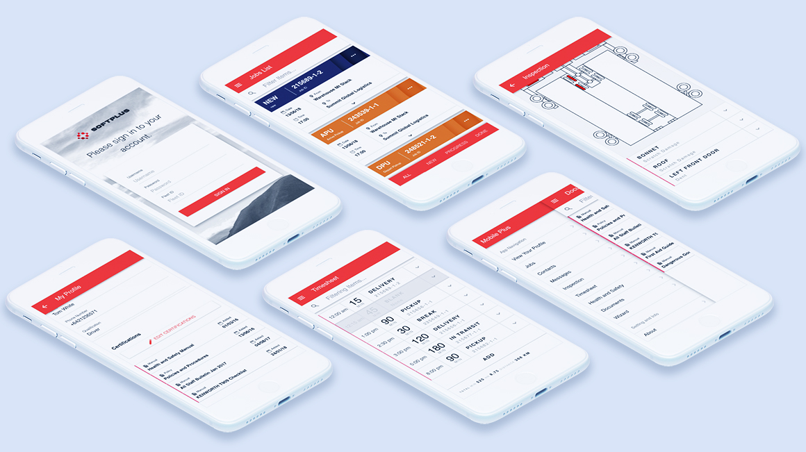
Signature on glass, proof of delivery, and GPS-aware flows had to be designed for field use — quick capture, offline tolerance, and clear next steps — rather than shrinking the desktop UI.
Wireframes and process flows — aligning stakeholders before high-fidelity UI and build
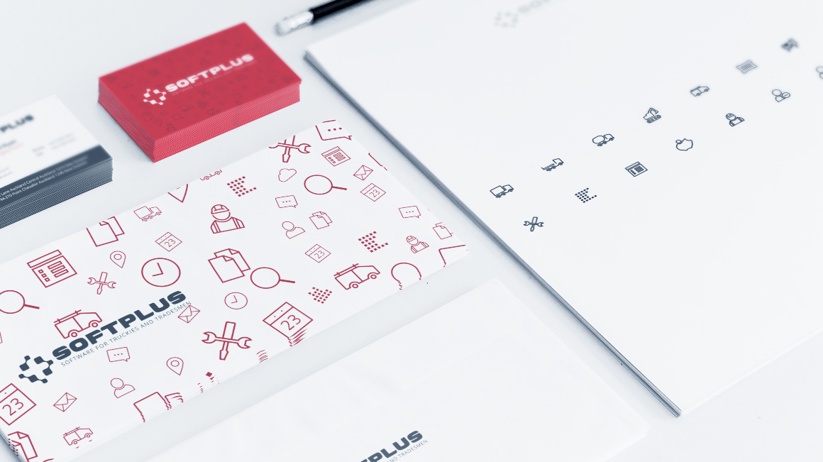
Strategic choice: We redesigned the Softplus brand — logo, colour palette, and typography — and applied it consistently across marketing and product UI. The goal was a single professional identity and a clear “one system” story for sales and marketing, while giving product design a visual foundation to build on.

Brand refresh — consistent identity across marketing and product
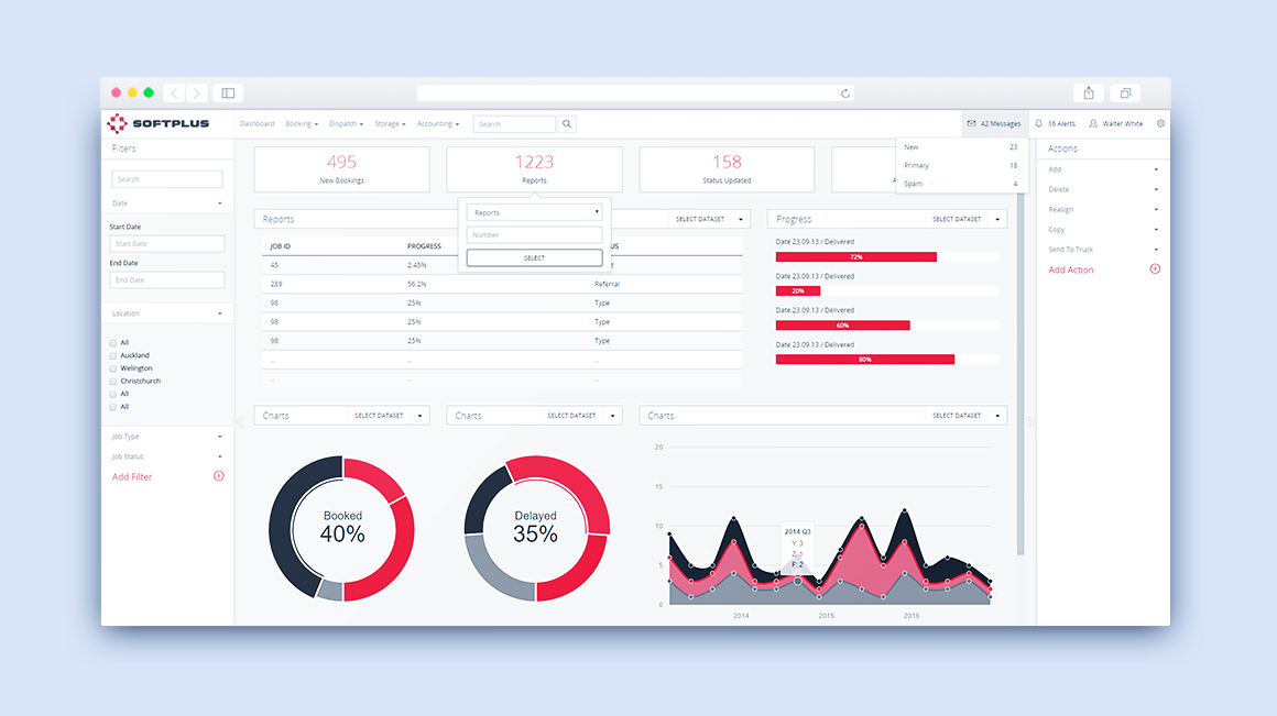
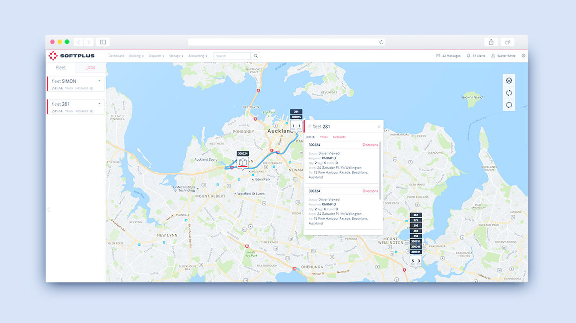
We introduced common patterns for jobs, routes, status, and rating so that dispatchers moving between general cartage (JobPlus), freight manifesting (FreightPlus), or contracting (FlexiJob) encountered familiar structures. Rationale: Reducing cognitive load and training time made the suite easier to sell and support; it also made it feasible to add new products (e.g. new verticals) without starting from zero.
JobPlus — dispatch and job management with shared patterns
We designed mobile flows for signature on glass, proof of delivery, and GPS-aware job updates so field workers could complete tasks without returning to the office. The emphasis was on fast capture and clear status, not replicating the full desktop experience. Rationale: Research showed that field users needed to log completion and capture proof quickly; overloaded mobile UIs led to errors and rework.
Mobile — proof of delivery and field capture
Customer portals and EDI/interfaces were designed so that external users and third-party systems could integrate without feeling like a separate product. We applied the same design language and interaction patterns where it made sense, so the “one system” story extended to how customers and partners experienced Softplus.
Customer portal — consistent experience for external users
I established a clear design process: wireframes, process flows, and sitemaps to align stakeholders, then UI mockups and prototypes to validate flows, then front-end design and implementation so that what we designed was what shipped. This reduced rework and made it easier to hand off and maintain consistent UI across the suite.
A single brand and design direction applied across JobPlus, FreightPlus, StorPlus, FlexiJob, and customer-facing touchpoints. The suite could be presented and sold as one coherent system.
Wireframes, flows, prototypes, and shared component patterns enabled consistent delivery across desktop, web, and mobile. New features and bespoke work could reuse patterns instead of reinventing them.
Dispatch, rating, storage, and contracting solutions continued to support organisations across transport and service industries, with a clearer narrative: from booking to billing, all your work in one system.
"The new look and feel made it easier to show customers that we're one platform, not a bunch of separate tools." — Sales, Softplus
"Once you know one product, the others make sense. The forms and screens work the same way." — Dispatcher, transport operator
We didn't capture baseline metrics before the refresh. To make design impact explicit, we would track time to complete key tasks (e.g. create and dispatch a job, complete a rating run), support tickets per product or per flow, and adoption of new portals or mobile features. NPS or renewal feedback tied to “ease of use” or “modern feel” would help tie design work to business outcomes.
Platform: Desktop, web, and mobile — dispatch, rating, storage, contracting, customer portals, EDI/interfaces.
Domain: Transport and service industry software (general cartage, freight, container, rural, contracting, warehouse).
Let's discuss product strategy challenges. st.slavka@gmail.com